In my last post on this topic, we loaded the Airline On-Time Performance data set collected by the United States Department of Transportation into a Parquet file to greatly improve the speed at which the data can be analyzed. Now, let’s take a first look at the data by graphing the average airline-caused flight delay by airline. This is a rather straightforward analysis, but is a good one to get started with the data set.
Open a Jupyter python notebook on the cluster in the first cell indicate that we will be using MatPlotLib to do graphing:
%matplotlib inline
Then, in the next cell load data frames for the airline on time activity and airline meta data based on the parquet files built in the last post. Note that I am using QFS as my distributed file system. If you are using HDFS, simply update the file URLs as needed.
air_data = spark.read.parquet('qfs://master:20000/user/michael/data/airline_data')
airlines = spark.read.parquet('qfs://master:20000/user/michael/data/airline_id_table')
Now we are ready to process the data. The next cell will essential do a group by and average type query, but it does some important things first for efficiency. First, we immediately select one those columns we care about from the data frame, specifically Carrier, Year, Month, and ArrDelay. This give Spark and Parquet a chance to create efficiencies by only reading the data that pertains to those columns. The second step is to filter out those rows that don’t pertain to the airlines we want to analyze. The next two groupBy and agg steps find the average delay for each airline by month. Then the query creates a new column YearMonth which is a display string for year and month, and drops the now extraneous Year and Month columns.
from pyspark.sql.functions import avg, udf, col
from pyspark.sql.types import StringType

def getYearMonthStr(year, month):
    return '%d-%02d'%(year,month)

udfGetYearMonthStr = udf(getYearMonthStr, StringType())

airline_delay = air_data.select(
    'Carrier',
    'Year',
    'Month',
    'ArrDelay'
).filter(
    col('Carrier').isin('AA','WN','DL','UA','MQ','EV','AS','VX')
).groupBy(
    'Carrier',
    'Year',
    'Month'
).agg(
    avg(col('ArrDelay')).alias('average_delay')
).withColumn(
    'YearMonth', udfGetYearMonthStr('Year','Month')
).drop(
    'Year'
).drop(
    'Month'
).orderBy(
    'YearMonth','Carrier'
).cache()
The final step is to create of each airline’s average delay over time. Here I want to use the human readable names of each airline, so the first task is to create a name dictionary for the airlines keyed by the airline ID. Then we create the graph. In both of these steps, the Spark data frame is converted to a pandas data frame, which has the effect of collecting all of the data in theSpark data frame to the master node. Generally, you have to be careful about doing this as the master node has limited memory. Due to the concise pull of data with the initial filter step on the data frame, the data set quite easily fits within the master node’s RAM.
To create the graph, I use the fairly standard matplotlib line graph. Since I have multiple airlines to graph, you will note I have to plot each airline separately into the graph. The x-axis are the year & month pairs, and these need to be converted into actual datetime objects before creating the airline specific graph line.
import numpy as np
import matplotlib.pyplot as plt
import datetime as dt

airline_delay_pd = airline_delay.toPandas()

carriers = ['AA','WN','DL','UA','AS','VX']

name_dict = airlines.filter(
    col('Carrier').isin('AA','WN','DL','UA','MQ','EV','AS','VX')
).select(
    'Carrier',
    'AirlineName'
).toPandas().set_index('Carrier')['AirlineName'].to_dict()

fig, ax = plt.subplots()

for carrier in carriers:
    carrier_data = airline_delay_pd[airline_delay_pd['Carrier']==carrier]
    dates_raw = carrier_data['YearMonth']
    dates = [dt.datetime.strptime(date,'%Y-%m') for date in dates_raw]
    ax.plot(dates, carrier_data['average_delay'], label = "{0}".format(name_dict[carrier]))

fig.set_size_inches(16,12)
plt.xlabel("Month")
plt.ylabel("Average Delay")
ax.legend(loc='lower left')
plt.show()
Running this notebook should yield the following inline graph:
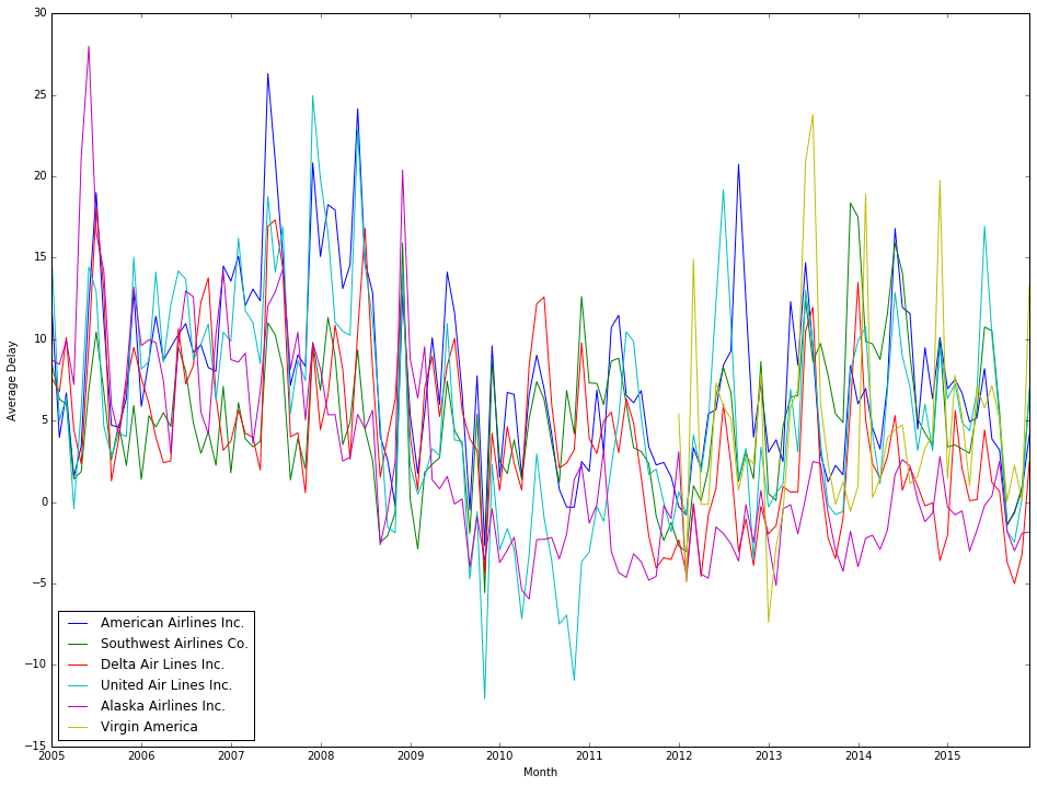
What is interesting to me about this graph is that the (selected) airlines look to have correlated trends in their average delay. Rather than drawing conclusions about correlation by eye-balling it, we can use a statistical measure of correlation called the Pearson Correlation Coefficient. Th correlation coefficient will give a measure of just how well correlated two data series are. Apache Spark has a native data frame method to calculate the correlation coefficient, but to use it, we need to reformat the data some. Specifically, we need to create a data frame where there is a column for each distinct airline with each row being a specific month’s average delay, as the correlation function compares two columns from a data frame. To accomplish this, I used a code pattern described in a Stack Overflow question:
from pyspark.sql.functions import col, when, max

# convert the airline rows to columns

airlines = sorted(airline_delay.select(
        'Carrier'
    ).distinct().rdd.map(lambda row: row[0]).collect())

cols = [when(col('Carrier') == a, col('average_delay')).otherwise(None).alias(a)
        for a in airlines]

maxs = [max(col(a)).alias(a) for a in airlines]

airline_delay_reformed = airline_delay.select(
        col("YearMonth"),
        *cols
    ).groupBy(
        "YearMonth"
    ).agg(*maxs).na.fill(0).orderBy(
        'YearMonth'
    ).cache()
This will produce a data frame with the following schema:
airline_delay_reformed
 |-- YearMonth
 |-- AA
 |-- AS
 |-- DL
 |-- EV
 |-- MQ
 |-- UA
 |-- VX
 |-- WN
Now, to calculate the correlations in flight delays between all the airlines:
from pyspark.sql import DataFrameStatFunctions
import pandas as pd
import numpy as np

corr_data = dict(
        (
            a,
            [airline_delay_reformed.stat.corr(a,b) if a > b else np.nan for b in airlines]
        ) for a in airlines
    )
correlations_df = pd.DataFrame(corr_data, index=airlines)
print(correlations_df)
Note that by using the if statement in the list comprehension we limit our computational work to calculating the correlation score between two airlines only once. One calculated, you should see a result that looks like this:
    AA        AS        DL        EV        MQ        UA        VX        WN
AA NaN  0.468001  0.580626  0.551466  0.718490  0.778896  0.029129  0.503715
AS NaN       NaN  0.526844  0.443933  0.345010  0.522625 -0.137774  0.192667
DL NaN       NaN       NaN  0.715151  0.571382  0.509096 -0.052562  0.480522
EV NaN       NaN       NaN       NaN  0.594915  0.600003  0.056209  0.485396
MQ NaN       NaN       NaN       NaN       NaN  0.647358  0.166137  0.656206
UA NaN       NaN       NaN       NaN       NaN       NaN  0.171475  0.517596
VX NaN       NaN       NaN       NaN       NaN       NaN       NaN  0.275750
WN NaN       NaN       NaN       NaN       NaN       NaN       NaN       NaN
The way to interpret correlation scores is that values close to 1 or -1 indicate strong correlation, but values close to 0 indicate little correlation.
You might note is that Virgin Airlines (VX) flight delay has poor correlation with most other airlines (if you processed the same 11 year data set I did). This is primarily due to VX data only being present in the data set for the more recent years. The strongest correlation found is between American Airlines (AA) and United Airlines (UA), and the second strongest correlation is between American Airlines and Envoy Air (MQ). It is important to keep in mind that correlation is does not imply causation. That doesn’t mean there isn’t a structural relationship between the onetime performance of two airlines, just that correlation isn’t sufficient evidence say the two airlines’ on-time performance records have a link. In a future post, we will search for clues as to what that structural relationship might be (if it does exist).
The Jupyter notebook behind this post can be viewed at my Github repository.
One thought on “Airline Flight Data Analysis – Part 2 – Analyzing On-Time Performance”